Procurement Dashboard Examples
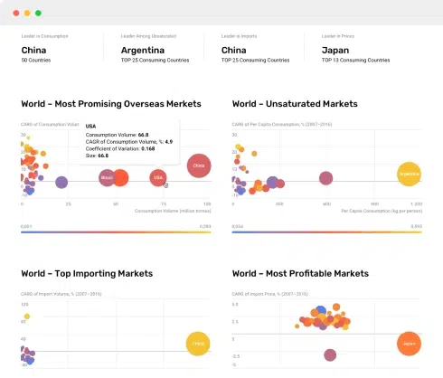
A procurement dashboard is an analytical tool used to visualize key metrics and data points related to the procurement process. These dashboards consolidate large amounts of procurement data into easy-to-read visualizations, allowing stakeholders to make informed decisions, streamline operations, and improve efficiency. Below are examples of common elements one might find in a procurement dashboard:
1. Spend Analysis:
This section typically includes visualizations such as bar graphs or pie charts that display spending by category, supplier, department, or geographic region. The goal is to understand where the expenditure is going and identify opportunities for cost savings.
2. Supplier Performance:
This might feature metrics like on-time delivery rates, quality scores, and contract compliance. A line graph showing delivery performance over time or a radar chart comparing different suppliers can be useful for evaluating supplier reliability and performance.
3. Procurement Cycle Time:
This portion of the dashboard tracks the time taken for various stages of procurement, from requisition to payment. Gantt charts or time series graphs can help identify bottlenecks in the process.
4. Cost Savings:
Key Performance Indicators (KPIs) such as cost reduction achieved through negotiations, discounts availed, and procurement process improvements are visualized here. An area chart or a line graph might be used to display cost savings over time.
5. Purchase Order Status:
A dashboard might show the status of purchase orders, such as pending, approved, or delivered. This helps in tracking the procurement pipeline and ensuring timely processing.
6. Compliance and Risk Metrics:
These include metrics related to regulatory compliance, supplier risk assessments, and any compliance breaches. A heat map can be a helpful visualization for understanding risk levels across suppliers.
7. Procurement Budget vs Actual Spend:
This visualization shows how the actual spending lines up against the budget. A deviation report visualized through column charts can help identify overspending or underspending in various categories.
8. User Engagement:
This might track the number of requisitions raised by different departments or users, helping to understand engagement levels and areas needing attention. This could be represented in bar charts or tables.
These examples illustrate the power of procurement dashboards in transforming raw data into actionable insights.
Nothing found. Please try again.
Nothing found. Please try again.
Nothing found. Please try again.


